
Planning Blog: Title Design

 Hey guys and welcome back to my blog! Today, I am going to discuss the designs of our titles for our final task. 


For the film , all the tiles are going to come onto the screen the same way. We are going to have them slowly appear on the screen and all of them will be in the middle. The titles will appear on the screen in a windshield wiper type effect. You will see part of the title fade onto the screen from one side until it's the full title showing. This helps creates the effect we want it to have on our audience. It helps creates that effect we ant because the fade onto the screen slowly will give the audience that anticipation that we want. We will put it all to the middle of the screen and we want it to be very minimalistic because we want the audience to have a focus on the opening sequence while the font of the titles adds to our genre while not overpowering. 


Next , let's talk about how long each title will be on screen. We want to have each title on the screen for about 3 seconds but we want to base it kind of off the importance of the title as well. In this film , we will have the title of our film and the director name be longer than all the others but the title will still be the longest by 2 seconds at least.


The font we chose for our titles 
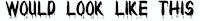
My group and I chose this font because we think it just adds more to our horror genre. The dripping on the letters would represent blood. We would have it be bold in whatever color we choose to give that "on edge" vibe to add onto the scary element of having the blood dripping. To enhance the blood aspect, we chose. We think the red enhances the blood giving more of a spooky aspect and creates a sense of fear for the audience which is what we want. We also felt this color would stand out in comparison to others.


The sizing of the titles would of course be different for different aspects and things that are more important. For example, the title of the movie would for sure be such a large text in comparison to the other titles. We also will make sure the title would be smaller than the name. So for example, if we are looking at "Directed By: Marvin Exantus", the "Directed By" would be kind of smaller than the name.  The size of the title would be AROUND THIS SIZE  while the name is AROUND THIS SIZE. Everything will be coordinated with one another using all the same when it comes to color size and font.


We think the choices we made will come off very well. We think it will work with typical horror genre conventions and we think the dripping blood will set us apart and be very unique. All will work together and come together to be great. 


Comments

Popular posts from this blog

Production Blog: Editing Blog

 Hey guys and welcome back to my blog. In my last blog you heard how we finally filmed! Not everything went as we planned but we had to make do. Today I am going to be telling you about the editing process of our film. I actually edited the film on my phone for the most part. The editing process took a very long time, longer than I expected. If I had to give a number, I would say this process took a total of 2-3 hours. But, we knew we had to make up for our filming aspect so I did what I had to do. We edited our short film on this app called CapCut. CapCut is a very popular editing app which I have used in the past. What I mean by this is I love how you don't have to be the most experienced at editing and your edits can still come out great. When editing, the first thing I did was gather the clips. Once I did this, I started to think about all the titles needed. When editing this, I took inspiration from a previous movie I researched. What I did intentionally, I made sure the effec...

Storyboard Blog

  Scene One- The first scene will start with Mya opening up the door to the courtroom. She will introduce herself, welcome the viewer to the courtroom, and then go look for the rest of the members. The camera will pan around the room to give a full view of the scene. Finally the camera will turn to Charlie and Kai.  Scene Two- The second scene will start with Charlie introducing himself. He would state his name and then, similar to a lawyer examining a witness, will ask Kai to introduce herself. After Kai says her name the camera will pan back to Mya who will go looking for the other members.  Scene Three- The third scene will jump cut to Joey asleep on a patio bench. Mya will walk into frame and wake him up. Once awake he will introduce himself to the camera.  Scene Four- The fourth scene will start with Kyra and I on a different bench. We will be in the middle of a conversation when Mya walks up to us and has us introduce ourselves. After we both introduce ourselve...

Research Blog

 Research: Music Videos Conventions and Codes    My group is doing a pop song for our music video. In most pop genre music videos, the audience usually watches people sing the lyrics to the song within the video. A lot of things are subject to the meaning or theme of the song and how the artist wants to get that across within the music video They usually wear costumes that go with the theme of the music video , so for example if the theme of the video involves them performing for a crowd they usually wear nice clothing like dresses, suits, etc. If the theme is midcentury, they usually wear old style clothing like knight armor, long skirts, etc. If the theme is casual, they wear casual clothing like t shirts, jeans, shorts, and sneakers. Props are also usually subject to the theme of the video. If they are performing in the music videos they might have microphones, a microphone stand, and a stage. If it's more midcentury them some props used could be a horse.  The app...